Best wishes to all of you during this holiday season and the new year. It was a pleasure to work with all of you.
I look forward to seeing you again in 2023!--
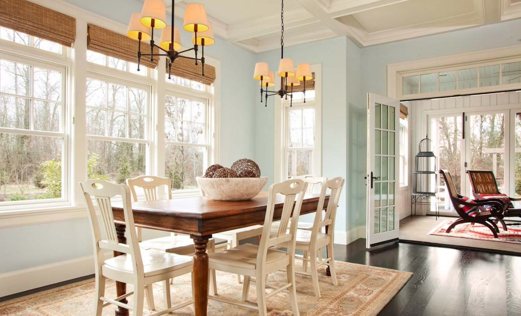
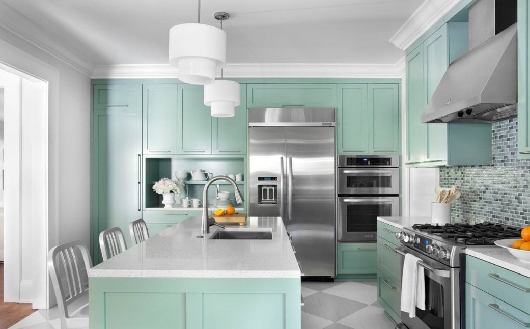
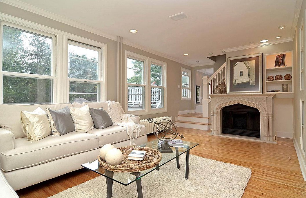
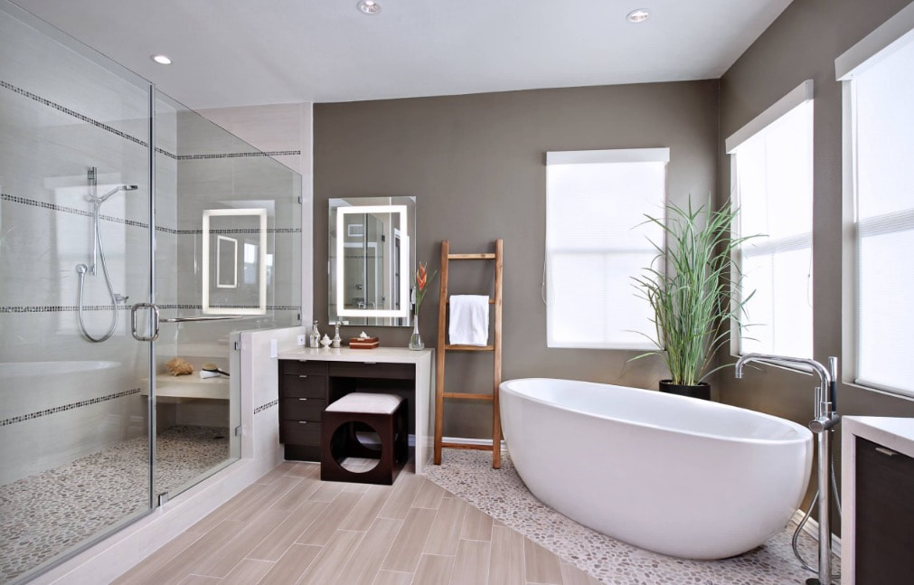
Many thanks to all of our clients and friends I have met and worked with in 2021 and throughout my journey in interior design. It was a challenge to wear a mask at design conferences, client homes and businesses-- but we all got through to the end of the year. Hopefully, masks will be a thing of the past in 2023!
Best wishes to all of you during this holiday season and the new year. It was a pleasure to work with all of you. I look forward to seeing you again in 2023!--
1 Comment
Don't paint your home with these colors. Save your eyesight and $5000 per year. Chloe Morgan writing for Mail Online saw this wild home color scheme on a home in Santa Barbara. The home is owned and color scheme selected by a well known artist who transformed her "beige and boring" mansion into a rainbow oasis. The owner spent two months transforming the detached sea-view home from what she termed a run of the mill paint job to what she calls a "piece of art"-- much to the distain of her neighbors and what I imagine would be a decrease in the property values of the surrounding homes. Maintaining the bright colors is a costly task. The house requires an annual paint job at a cost of $5000 to stop the colors from fading in the harsh sunlight-- resulting in the house becoming even bolder each time a new layer of paint is added. The colors leave visitors stunned and smiling, with passers-by dubbing it the "rainbow house". As much as I love color, this is much too much for me!
The May, 2020, issue of Interior Design Magazine had an interesting article about interior design in our social distancing environment. The visualization of product online today will become commonplace in the future. To prepare for a future that is more digital, we're becoming more visual in the way we communicate product options and manufacturing abilities to the architecture and design communities. We probably will not spend as much time in brick and mortar showrooms as we have in the past. So grab those computers and screens and apply what we learned during the social distancing process. Design specifications take between 20-39 percent of a designer's time, and we will all be online much more for our clients than we have in the past.
Interior Design Magazine tells us their color "first light" is Benjamin Moore & Co.'s 2020 color of the year. It is a warm, rosy pink, much like the first light of dawn. It symbolizes an upbeat and hopeful start to the next ten years in a spectrum comprised largely of pastels. This trend toward expressive, saturated colors signifies a departure from the more subdued Color of the Year 2019, the off-white Metropolitan, which was an intentional departure from that color. "It's going to be the new decade, and we knew this was a big moment for us to do something interesting," says Hannah Yeo, Color & Design Manager at Benjamin Moore & Co. Today's changing technology, environmental concerns, and cultural and economic influences are all shaping how we live. More than ever, we expect the home to provide security, comfort, community, self-expression, and optimism. We said, what are some of the colors that would really help with that?" Hence the company's arrival at First Light as well as it's Color Trends 2020 Palette, a spectrum comprised largely of pastels including jade-green Crystalline AF-485, sky-blue Windmill Wings 2067-60, and sunny Golden Straw 2152-50, among others. "We're always looking at the past and evolving" says Hannah Yeo. "We said let's step back, relax and find the comfort in our own homes. Once we've done that, we're really ready for the next step."
"Now let's use color to express ourselves, be a little more upbeat, and happy." She concludes. "We all need that optimism in our lives." Omotenashi is "an approach to hospitality built around anticipating guests' needs", according to Interior Design magazine. Alas, I did not win this yacht on my recent design conference in Las Vegas, but was intrigued by the omotenashi concept. A light color scheme fosters a "sense of openness, combined with enveloping curved lines for a comfortable cruise, according to the magazine. Lexus recently premiered this flagship luxury yacht in Florida. It is the rxusult of a collaboration with an Italian yacht designer and Marquis Yachts in Wisconsin. Lexus attempts to bring the design of its luxury cars to a sport yacht. Exterior details include a pronounced bow and coupe-like roofline, with metallic accents and an optional two-tone color scheme, according to Interior Design magazine. Whether designing your home, office or yacht, the omotenashi concept of openness, lightness and hospitality is a concept you may wish to explore.
Every year I am inspired by wonderful new design concepts from the Hospitality Design Convention in Las Vegas. HD Expo is the leading trade show and conference for the hospitality design community. Bringing together thousands of designers, owner/operators, brand executives, architects, purchasers and manufacturers for three days of inspiration and exceptional networking. I get plenty of exercise walking through the three day show viewing thousands of new designs from all over the world. It is a wonderland of new color, fabrics and inspiration I can bring to all of my clients. I am also inspired by the design of my shoes. After three days of walking through the Las Vegas Convention center I am thankful I continue to be ambulatory. Thank you for your continued interest in Lynne Usinger Interior Design. I enjoy working with all of you!
This neon trio has been introduced as a set of new colors for 2019. "If we look to the ideas influencing culture today, technology stands at the forefront," writes Eleanor Innis at Shutterstock. She feels color is "a universal communicator, a dynamic force of the visual world that brings life and meaning to everything we see. There's an excited energy driving this movement, so it's no wonder that 2019's color trends pack a digital punch." UFO Green can evoke lush countrysides with binary code, as we saw in the movie The Matrix. Buzzing neon signs, humming devices and vibrating phones are reflected in Proton Purple. A sizzling hue with lots of depth, Plastic Pink captures the electric glow of cities at night. Planning a trip abroad? Popular colors vary in different countries, from lavender blush in Japan to plum in the U.K. Going to Canada or Mexico? Think blue. Staying in the U.S? Think green. We found it fascinating how color preferences vary around the world. Eleanor Innis at Shutterstock also writes "the colors we love in any given season reflect more than trends in fashion, home decor, or design – they represent our cultural moment. Take the subdued, pastel shades of the '50s. Clean robin's egg blue or pale, pat-of-butter yellow gave people a sense of peace and safety after a tumultuous decade. The natural greens and browns of the '70s aligned with the growing conservationist movement, and the first Earth Day."
Can World War One ship camouflage influence interior design? We found an interesting article by Megan Swoyer of Sherwin-Williams paints about this interesting concept. Imagine using art as a wartime defense. That's exactly what the strategists behind Razzle Dazzle Camouflage had in mind during WW1 when they suggested painting warships in a way that distracted and confused the enemy. Today, the influences from this defense tactic are showing up in unexpected places: On the walls of cafes, stairways and clients' homes as an element of interior design. These bold, geometric patterns are now being used in commercial and residential projects as a design element on painted walls, wallpaper and fabrics. Of course, the last thing interior designers and color experts want to do is confuse homeowners with strange interior patterns, but there is certainly something to be said about the idea of injecting a dose of dazzling excitement and complexity into interior design. How did this type of art go from warships to walls? Dazzle camouflage, also known as razzle dazzle was a ship camouflage technique used extensively in WW1 and to a lesser extent in World War II and subsequent wars. The designs featured complex patterns of geometric shapes in contrasting colors, interrupting and intersecting each other intending to mislead the enemy about a ship's course. These patterns can also be used on a monochrome rather than a color basis, but it is suggested it be used in smaller spaces, like powder rooms or entryways as it could be overwhelming if used on a large scale.
I would have to carefully study this technique prior to recommending it to my clients, but thought from a design and historical perspective the concept is very interesting. Have you purchased paint lately? The cost is soaring, along with the high labor costs of painting contractors. We found a very informative article by Tara Mastroeni at freshhome.com about how to pick the color for your interior design projects correctly the first time to avoid expensive repainting errors. Selecting proper paint color is never easy. The color of the paint can change throughout the day with sun and shadow, and can change during the evening hours with artificial lighting. The author of the article suggests you pick your textiles prior to selecting the paint color. If you base your color palette on an existing product, you're far more likely to find a coordinating shade of paint. Start your design projects by building off a single piece that catches your eye. Patterned items are particularly good options because they often incorporate multiple shades and can be used as the basis for your entire color scheme. I attempt to make all elements in a home "talk to each other." Paint color can be a unifying element. Avoid giving each room its own distinct style and color scheme while forgetting to account for the fact that your home needs to feel cohesive. Ask your paint supplier to provide a large color sample of each color of paint you are interested in and tape them on the walls of your home. The colors will change throughout the day so be sure to evaluate any color shifts prior to selecting the final palette. Paint finish is sometimes not considered when choosing colors, but it is a very important consideration. Paint can vary from a flat finish, to egg shell and satin, to a semi-gloss and high-gloss finish. Each has a significant impact on the final result of your painting project-- so choose wisely. If you are unsure of your choices an interior designer may be able to help with the many considerations in choosing the correct paint color the first time.
Below is a link to this very informative article on how to choose the correct paint for your home or office design project. Tax season again? I was jokingly asked by a client if I could design a whiskey bar to help her through the tax season. I found an interesting article for her on The Salonniere website showing how to design a whiskey bar. If she is serious, I will head straight to Bevmo! to further my design education. The author recommends stocking your bar in the following way: 1) Limit your options. Stock your bar with with one higher-end "Snobbish Sipper" whiskey, another for the "Experimental" drinker, and a go-to brand for cocktails. These should be labeled accordingly to inform and inspire your guests. "By limiting the options, you reduce the stress of having too many choices, create conversation starters, and decrease the footprint of your party setup." 2) Match the glassware to your whiskey. The author recommends snobbish sippers get Glencairns and wine glasses. Experimental types find their bliss in rocks glasses and collins glasses and coupes work best for whiskey based cocktails. He states "this almost certainly guarantees dirty dishes, breakage and rings on your furniture, but this is merely collateral damage for a well-lubricated event." 3) Stock a variety of ice. People enjoy ice in their whiskey, and people enjoy correctly chilling and diluting their cocktail. The temperature and speed of dilution can affect the taste of whiskey, so you will need three sizes of ice to accommodate varying preferences. The author recommends some large cubes of ice, medium one-inch cubes for cocktail making, and then small cubes. He recommends you offer a small selection at the glassware table with additional ice in the freezer. George Bernard Shaw once said "Whiskey is liquid sunshine." See you at Bevmo!
|
AuthorLynne
Usinger Archives
December 2022
Categories |
|